Summary statistics
The main results page gives a table with some summary statistics:

Total reads: total number of reads sequenced.
QC reads: the number of reads (randomly) selected for the QC analysis.
Reads w/adaptor: the number of 'QC reads' containing adaptor sequence (for Illumina sequencing).
Reads mapped: the number of 'QC reads' that mapped to the assembly used for the QC analysis. Here 770183/1003486 = approximately 76.8%.
Reads paired: the number of 'QC reads' that mapped as pairs to the assembly.
Reads mapped (rmdup): the number of mapped 'QC reads', after removing duplicate reads.
Total bases: the total number of bases in the reads sequenced (each read is 100-bp in this example).
QC bases: the total number of bases in the 'QC reads'.
Bases postclip: the total number of bases in the 'QC reads', after soft-clipping some (presumably erroneous) bases at the ends of reads [I am guessing this is soft-clipping rather than hard-clipping.]
Bases mapped: the total number of bases in the mapped regions of mapped 'QC reads'.
Bases mapped (rmdup): the tota number of bases in the mapped regions of mapped 'QC reads', after removing duplicate reads.
Assembly: the assembly that the 'QC reads' were mapped to.
Mapper: the mapping algorithm used.
Cycles: the number of sequencing cycles used. 100 cycles gives 100-bp reads.
NPG QC: says whether the data passed the Sanger 'NPG' group's QC analysis [I'm guessing this].
Error rate: the percent of bases sequenced that are erroneous [I think this is estimated from some spiked DNA from a genome whose sequence is known].
Duplication rate: the percent of reads that are duplicates [I'm not sure how this is estimated].
Genome covered: the bases of the assembly that are covered by mapped 'QC reads'.
Coverage depth: the estimated sequencing coverage of the assembly [I'm not sure exactly how this is estimated. I think it must be estimated from the regions of the assembly where there are 'QC reads' mapped.]
Histogram of GC content of reads
This plot shows a histogram of the GC content of the first reads in fragments (red), the second reads in fragments (green), and the reference genome. Presumably to calculate the histogram for the reference genome, regions of the same length as the reads (100-bp here) are sampled from the reference genome.
In this example, we see that the modal GC content of the RNA-seq reads is about 42.2%, while the mode for the genomic DNA is about 28%. This is not unusual, because the RNA-seq reads originate from the coding regions of the genome, so may have a different GC content than the whole genome.

Histogram of inferred insert sizes for read-pairs
This plot gives the inferred insert sizes for the mapped read-pairs, for all pairs (black line), 'innies' (green line), 'outties' (blue line), and other pairs (purple line). [I'm not sure why there's a big peak at 1049 for the innies here(?)]

Plot of base qualities versus sequencing cycle
This shows that there were 100 cycles of sequencing carried out for the forward reads, and 100 cycles for the reverse reads. At each cycle (height in the plot) it gives the number of bases sequenced that have a particular base quality. Base quality is along the x-axis. The number of bases is shown using a colour scale, which is given in the key on the right, where black is the lowest quality, then blue, then green, then red is high quality and white is the highest quality.
In this example, it seems that the base quality was slightly lower in the first 10 cycles (about quality 30), and then stayed at about 35-38 for all of the cycles until it goes down a little again near the last cycle. The same pattern is seen for the forward and reverse reads. I guess what would be worrying would be if the base quality changed a lot during the cycles.

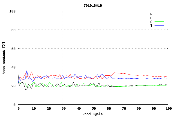
This plot shows the number of bases of each type (A, red; C, black; G, green; T, blue) sequenced during each sequencing cycle (out of 100 sequencing cycles, in this case). In this example, there are slightly more As and Ts sequenced than Gs and Cs, at each point.
Histogram of read qualities for forward and reverse reads
This plot has a histogram of qualities for forward and reverse reads. I think the lines represent different sequencing cycles, so the red line is cycle 1, the next line is cycle 2, and so on up to cycle 100, as we had 100 sequencing cycles in this example [is this right?] I'm not sure if this is average base qualities in reads, or mapping quality of reads (?). I think it must be base qualities.

This plot shows the median (black line)), mean (red or green line) and interquartile range (grey area) of the qualities for forward and reverse reads (y-axes), versus the sequencing cycle (x-axis). I'm not sure if this is average base qualities in reads, or mapping quality of reads (?). I think it must be base qualities.
We see that for the forward reads, the quality is low for the first ten cycles, then increases, and then decreases again slightly for the last 10-15 cycles. This is also seen for the reverse reads.

Here's one that looks pretty bad, it looks like the quality went down a lot during the sequencing cycles:

This plot shows the count of insertions (red line) and deletions (black line) versus the sequencing cycle (on the x-axis). Presumably this was estimated for some spiked DNA, for which the sequence was already known.
We see that in this example the amount of insertions and deletions is fairly low for the first ten sequencing cycles, then increases, but stays steady until the last ten cycles, when there is a peak in indels.

Plot of log(indels) versus indel length:
This plot shows the log of the number of indels seen, versus the length of the indels in base-pairs, for insertions (red line), deletions (black line) and insertions plus deletions (green line). We see that there is not much difference in the pattern for insertions compared to deletions. For both, there are mostly smaller indels seen, and few large indels of >20 bp.

Plot of the number of mismatches versus the sequencing cycle:
This gives the number of mismatches (compare to the assembly used in the QC analyses, presumably) versus the sequencing cycle. Different plots are drawn for base positions at mismatches with base qualities of >30 (red), base qualities of 15-30 (green), >=15 (blue) and Ns (purple).
Overall there seem to be most mismatches for the first 10 cycles, and for the last 10-15 cycles. We see that there are more base positions with lower qualities (green or blue) for later sequencing cycles than for early ones, although the first ten sequencing cycles also have quite a few low quality bases at mismatch positions (green).

Histogram of coverage:
This plot shows a histogram of coverage at the base positions for which we have mapped reads (mapped 'QC reads'). Here we see that the coverage ranges from 1 to about 37.

Plot of quality versus sequencing cycle:
This shows the quality versus sequencing cycle, for forward reads and reverse reads. I'm not sure if this is average base qualities in reads, or mapping quality of reads (?). I think it must be base qualities. I think this is the same as the lines for the mean values in 'Plot of read quality versus sequencing cycle, for forward and reverse reads' (see above).

Here's one that seems to have gone wrong, where the quality seems to have gone down a lot during the sequencing cycles, particularly for reverse reads:

Plot of mapped depth versus percentile of mapped sequence ordered by GC content:
On the x-axis we have the percentile of mapped sequence, ordered by GC content. For each percentile, we have the median mapped depth (blue line), the interquartile range of mapped depth (blue area), and the 10-90th percentile of mapped depth (grey area).
In this example, the mapped depth increases with the percentile of mapped sequence, so seems to increase with the GC content. That is, there seems to be a greater median depth for higher-GC content than for lower GC content. This is a little worrying, as it suggests that there was more efficient mapping for high-GC sequences.

NPG stats
An alternative to QCGrind is NPG stats. For example, if the link to a QCGrind page is:
and the link to a liane in NPG stats is:
No comments:
Post a Comment